Bold and Beautiful
Saturated color tells a story in an Evanston home by Studio Sven.
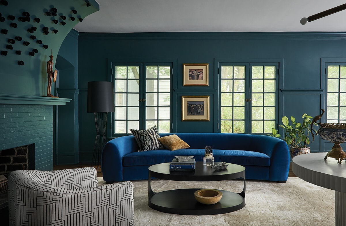
A curvaceous sofa keeps company with a floor lamp and coffee table from Noir Furniture through CAI Designs. The art installation on the fireplace is by Gold Leaf Design Group.
“Little carried over from their first home except their love of purple.” —Lauren Svenstrup
Lauren Svenstrup has never been timid about color. Rich, saturated tones are one hallmark that draws a certain type of client to her design firm, Studio Sven. The owners of this 5,600-square-foot, six-bedroom house in Evanston were so happy with the way she’d transformed their Logan Square apartment in Chicago that they requested a reprise when they moved to the suburbs to start a family.
The projects could not have been more dissimilar. “They went from an open-plan apartment to a historic home with individual rooms and lots of architectural detail,” says Svenstrup. “The floorplan was a circle, where all main rooms connected off the entry. Each room had to have its own personality, but they also had to tie into each other since they’re all visible from there.” The kitchen, already a Franz Klein-like blue, became a springboard for plotting how complementary colors would move through the spaces.
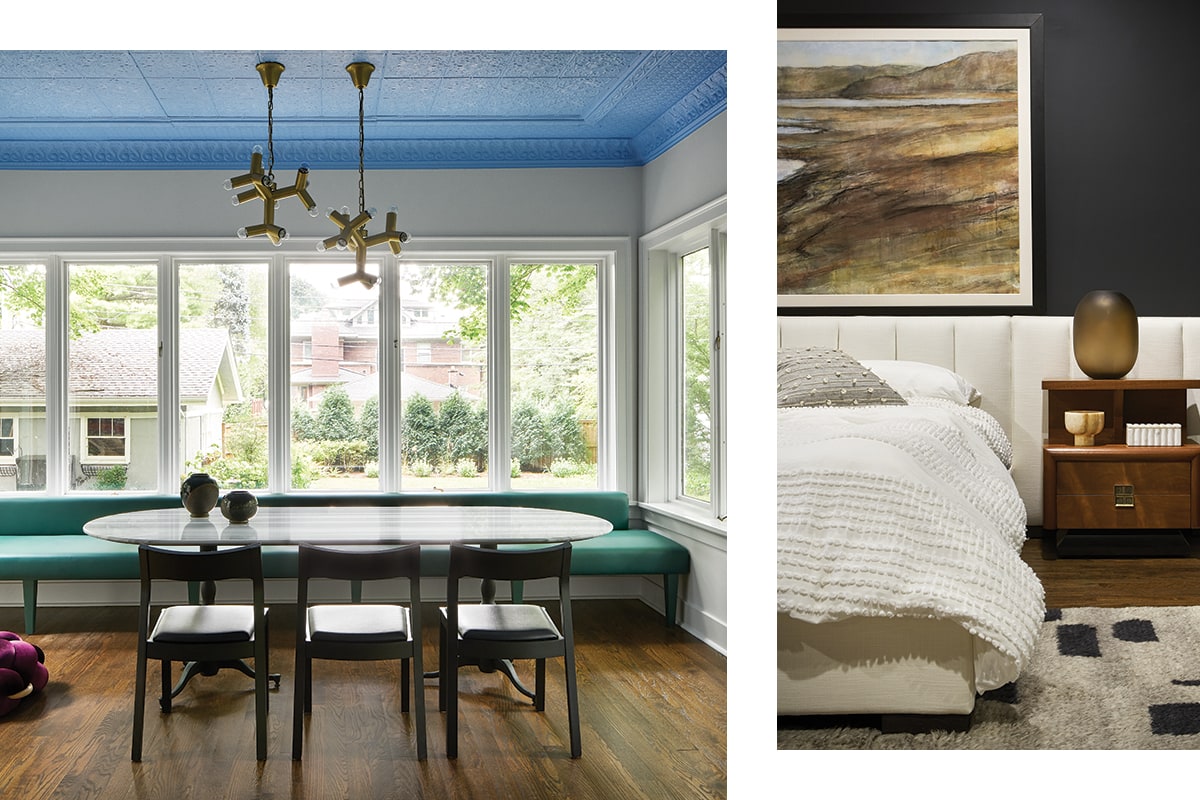
The great room’s custom banquette (left) triples as table seating, mudroom and and impromptu lounging spot. Over the custom table are Noir Furniture pendants. The blue ceiling paint is by Benjamin Moore. The bed is flanked by vintage nightstands (right) and Arteriors lamps. The client’s own artwork hides the master bedroom’s only window, whose awkward placement would have thrown the bed off-center.
In the adjacent great room, Svenstrup painted the pressed-tin ceiling Benjamin Moore Haitian blue, referencing the Southern custom of deploying this color on porch ceilings to ward off evil spirits. She also covered a custom banquette in turquoise vinyl from Kravet. The latter serves multiple functions, offering functional additional seating for a table and chairs from the former residence. “But next to it is the back entrance,” she says, “and by off-centering the table, it left an open end where you can sit and take off your shoes. It acts like a hidden mudroom. You also have the pouf and cocktail table, so you can put your feet up with a glass of wine. Overhead are Noir Furniture pendants from CAI Designs.
“They met at Northwestern University,” says Svenstrup of the young clients with two toddlers. “Every client I’ve had who graduated from there loves purple.” Hence the plum-walled dining room, where another Noir Furniture chandelier hangs over a customized Phillips Collection table. Here, she notes, “The chair rail and wainscoting broke the room in half and made the ceiling feel lower. So, I painted it all purple, but varied the textures by painting matte over the existing grasscloth and using a satin finish on the moldings and details. I’m a person who believes in painting everything the same color. I love the impact.”
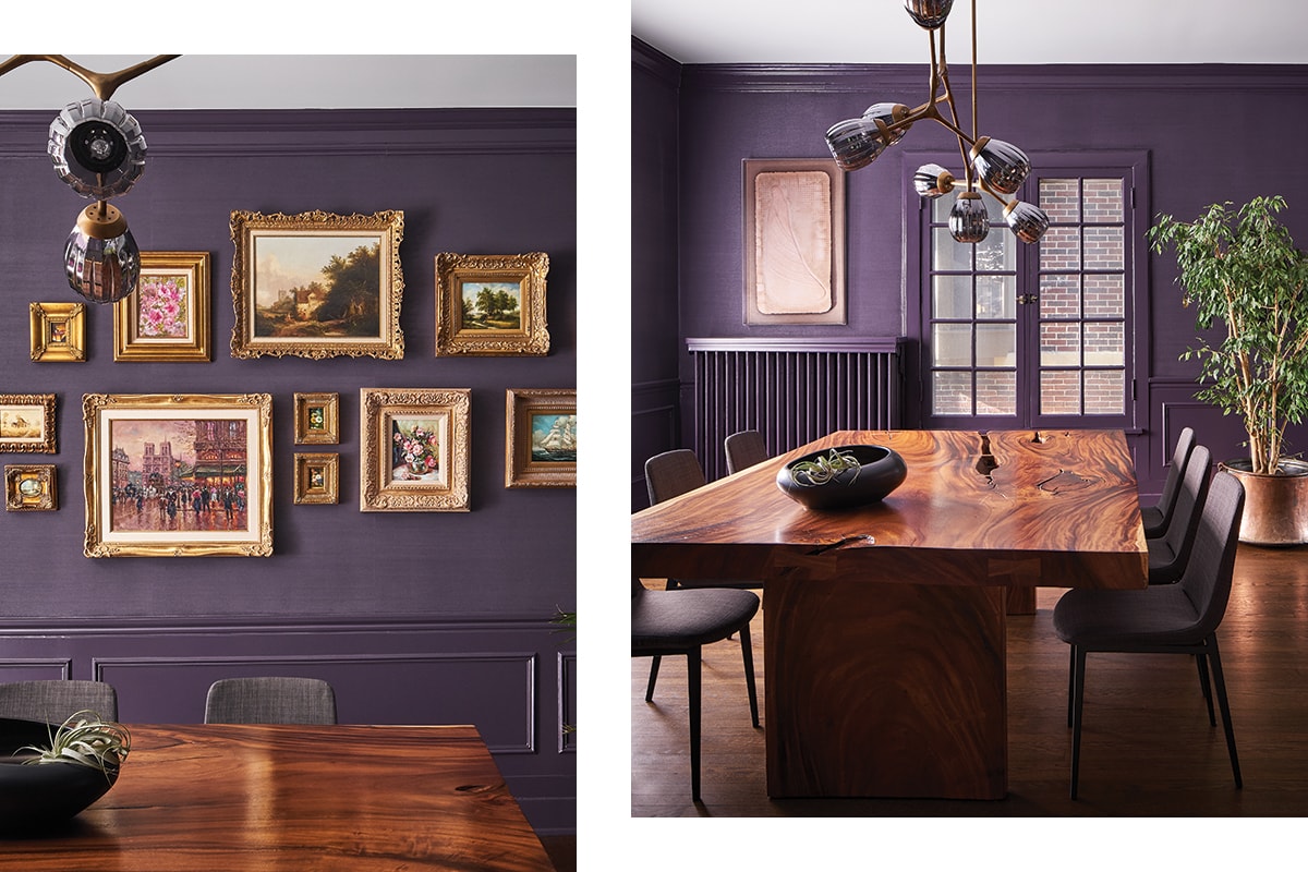
A wall (left) becomes a gallery for artworks handed down from family in the dining room. A Phillips Collection table is illuminated by an Arteriors chandelier, both through CAI Designs. Colors throughout are Benjamin Moore.
Svenstrup unified a diversity of architectural detail in the living room by completely coating the envelope in lush teal. “They had antiques and furniture pieces that leaned midcentury,” she says, “so we were already dealing with an eclectic look. I brought in lines and shapes that were more contemporary to bring them together. Some lean a little Art Deco.” To wit: a blue velvet sofa, which also brings things full circle by echoing the kitchen color. Svenstrup commissioned Chicago-based Gold Leaf Design Group to create an installation of ceramic egg shapes on the fireplace. “I wanted to call attention to the curved wall,” she says. “It looks like something organically growing up it.”
Many doors broke up the master bedroom walls. Painting everything black both blended it all more harmoniously and created a contrast to the bright, all-white sunroom connected to the space. “The eye is always drawn to contrast. If I’d painted the doors white, the message would have been ‘I have to go,’” concludes the designer. And that, of course, is the last vibe you’d want.
Instead, the color progression invites us to move naturally from one space to the next. It creates a deep, moody narrative we feel compelled to follow.
“I love banquettes. They’re a functional approach to seating.” —Lauren Svenstrup