Bungalow Life
A 1925 Chicago bungalow gets a respectful but modern makeover courtesy designer Kat Buxton of Elliott Design Studio.
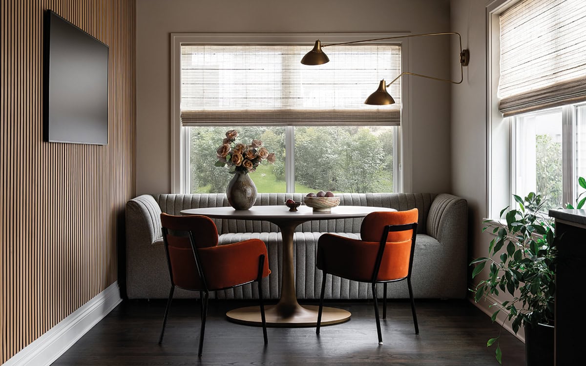
This dining nook in the kitchen is where the homeowner spends most of his time. A plush banquette provides a counterpoint to the sculptural form of the midcentury-style table. Side chairs in bright orange velvet add a juicy burst of color. All paint by Benjamin Moore.
When you have a chance to work on a 1925 Chicago bungalow, you don’t turn it down. At least, that’s how designer Kat Buxton of Elliot Design Studio felt the minute she saw the historic property. “Our client bought what was pretty much a tear down bungalow. But we love the integrity of Chicago architecture. It’s so good, you have to keep it.” Her client, being in real estate, was always looking out for properties like this one, and decided that this one was a keeper.
The home presented many challenges, not the least of which was the cracked foundation and a slightly cramped layout. Buxton says, “We got an amazing builder—Wolff Contracting and Development—who helped us figure out the foundation issues and rework the floor plan, deciding where the stairs go and adding a tiny addition on the back to basically fit the refrigerator.” Buxton shares that the client wanted to keep the integrity of the architectural details in the historic property. “We didn’t want to mess with it too much, but we wanted to make it modern and livable.”

The kitchen and dining room are connected but separate, so Buxton created a cohesive look by continuing the dark color palette in both rooms. The kitchen cabinetry in sage green offsets the black tile backsplash and vent hood. A Wolf range and integrated Thermador dishwasher, refrigerator, and wine cooler provide maximum functionality. All paint by Benjamin Moore.
She set to work to find the sweet spot between 1925 and 2025, keeping and refinishing the original wood floors, hardware, and architectural moldings (and even adding some where they had been stripped away), and adding new windows, moody colors, and a new, more comfortable layout for the upstairs primary bedroom and bath.
For the decor, Buxton leaned into the midcentury pieces the client already owned and tried not to choose anything from more modern eras. Lighting, textiles, rugs, and furnishings all have a modern sensibility but evoke that period, and blend with the Arts and Crafts architecture. The living room is used as much for putting your feet up and watching a ball game as it is for entertaining. In the kitchen, Buxton used a sage green for the cabinetry and grounded the room with a dark tile backsplash and soapstone countertops. She threw in a vintage flea-market find runner to add a classic touch. The dark wall continues into the dining room. “It’s not an open plan layout, and we wanted to tie the rooms together without changing the architecture. There’s something nice about having a formal dining space, which was much more common in those days but seems to be making a comeback.” The breakfast nook in the kitchen satisfies the need for a more informal space and is where the client spends a lot of his time. “We added the pop of orange for the chairs and kept the banquette neutral. It adds a wonderful element in the predominantly masculine theme of the space.”
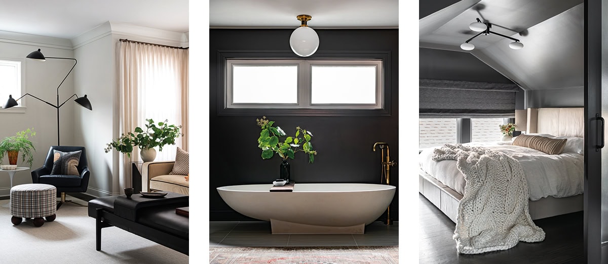
Left: The living room lightens the mood with a soft palette and chairs designed for comfort and style. Drapery fabric by Romo, pillows by Schumacher, and rugs and carpeting by Watson Smith and Stark.
Center: The primary bath includes a hand-me-down tub from the client’s mother, in dramatic contrast to the black wall behind it. Tile by Artistic Tile, paint by Benjamin Moore.
Right: The primary bedroom nestles under the sloped eaves of what was formerly the attic.
Upstairs, Buxton used the sloped roof attic to create a comfortable primary bedroom and adjacent bath. She pitched the black tile wall in the bath to the client who thought she was “crazy,” but he trusted her to do it. The vintage tub, which was a hand-me-down from his mother, and the white tile floor provide a counterpoint to the moody wall. The bedroom, Buxton says, was a particular challenge. “We had to ask ourselves where does the bedroom go, and where does the bathroom go? And we chose to use the space with the higher ceilings for the bathroom and then make this bedroom like its own little cozy cove.” Fitting the king-size bed, clad in leather, into the space was an additional challenge. “A bedroom with this low of ceiling can feel suffocating if you don’t do it right. Especially when you decide to paint the whole room dark, including the ceiling. But the goal was to make it this like cozy little sanctuary.”
The masculine vibe of the home, initially agreed upon by Buxton’s single client, is now also occupied by his girlfriend, who loves it just as much as he does. “His past homes have been the more just gray neutral palettes. And so, he was really interested in having those pops of color where it made sense. And fortunately, his girlfriend really embraced the vibe as well.” Life continues apace, blending new and old, in a piece of Chicago’s architectural history.