How to Renovate a Classic Building Without Losing Its Character
A 19th-century, down-at-the-heels row house gets a bespoke makeover.

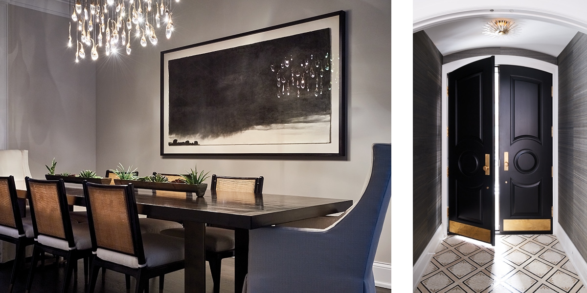
An image by photographer Jungjin Lee and a dazzling fixture from Ochre through David Sutherland generate a distinctive mood in the dining room. Custom dining table by Parish Co., chairs by Stanford Furniture, through deAurora. In the entryway, wallcovering by Phillip Jeffries is illuminated by lighting from Visual Comfort through CAI Designs.
“So much of the focus of this project was the architecture. The whole idea was that the furniture could and should be a little bit more understated.”
Naturally, interior design is as varied as our moods, but no matter what your taste, it’s hard not to appreciate the calm composure that defines this residence on Chicago’s Gold Coast. Transformed from a tired multi-unit dwelling into an architecturally sophisticated single-family home by architect Peter Harlan of Jackson Harlan Architects, this 19th-century row house has been masterfully appointed by Oak Park, Illinois designer Kelly Cleveland.

Left: With a wall of glass, this windowless room borrows light from a skylight atop the main staircase. Accessories from CAI Designs.
Right: In the living room, richly elegant fabrics from HOLLY HUNT, Cowtan & Tout, and Samuel and Sons add texture. An antique bench graced with fabric from Colefax and Fowler through Osborne & Little, and accessories from Arteriors through CAI Designs add a comfy vibe.
Although the building required a total gut, the new program and deft detailing hint at the property’s original character.
“When you enter the house, it doesn’t look like a brand-new home,” suggests Cleveland. “You can tell it’s been renovated, but we painstakingly tried to offer some sense of its past.”
The black, white, and gray color palette was set by the client, but Cleveland worked hard to specify just the right shades to guarantee a level of richness and contrast. “Picking the right shade of white can be excruciating. Some can make you feel like you’re in a surgical space. I usually pick tones that are little bit more grayed out because they’re more calming and soothing. But we wanted to call out all the architectural details, such as the crown molding, so I used a crisp white there and kept the walls a lighter, gray white.” The designers’s artful orchestration of a limited palette is manifest in the kitchen. Here, she painted the perimeter cabinets black to give visual weight to the room and kept the island light with Benjamin Moore’s Owl Gray.

A sunny bay in the kitchen is the perfect spot for morning coffee and informal meals. Stools by Century Furniture line the island. A restricted color palette was no impediment to creating an appealingly functional kitchen. A high-tech refrigeration unit by Sub-Zero completes the picture.
“We painstakingly tried to offer some sense of its past.”
The home’s furnishings go a long way in underscoring that echo of the past Cleveland was determined to conjure. It’s not
that she sourced scads of antiques or went exclusively with heritage upholstery patterns. Rather, traditional, and transitional profiles create a subtle, eye-filling sense of comfort, that deep familiarity that characterizes a well-loved home, rather than a showplace. “Not every piece has to make a statement,” she says. “There were a handful of pieces original to the client and then quite a bit that we bought. But so much of the focus of this project was the architecture. The whole idea was that the furniture could and should be a little bit more understated, stuff that is not too precious.” Which isn’t to say the home is lacking jewel-like touches. A meltingly fluid fixture from Ocher dangles above the dining room table and the kitchen sports low-backed brass stools upholstered in emerald green.

Left: Salvaged Gothic architectural elements make an impact in this child’s bedroom. Animals parade by in wallpaper from Pierre Frey through HOLLY HUNT.
Right: A glossy, deep-soak tub by Victoria + Albert through House of Rohl Studio, surrounded by tile from Ann Sacks and highlighted by lighting from Visual Comfort through CAI Designs, oozes both glamour and relaxation. Furniture by Baker Furniture, and fixtures by Kallista, available at K&B Galleries and Ann Sacks, and hardware by Waterworks complete the picture.
“In theory, good design is seamless. It doesn’t scream at you.”
One of the more striking architectural bits in the house isn’t found in the living or dining room, but upstairs, in a child’s bedroom. Incorporated into new millwork carved in complementary arch motifs, are two gothic elements salvaged from a church in New Orleans. Framing a dressing table backed by a wall covered in a playful Pierre Frey paper depicting elephants and camels, this striking composition is both sophisticated and whimsical—and utterly unexpected.

Left: Hardware by Classic Brass through Katonah Architectural Hardware enhances the bar area, designed by Kelly Cleveland.
Right: An impressive metal-framed bed from Kravet dominates the primary bedroom.A seating area with chairs and side table from Lee Industries through CAI Designs, provide a chic place to read or reflect on the day. All paint throughout by Benjamin Moore.
Between construction and applying the final touches, the project occupied Cleveland for three years. Looking back at her efforts, she says, “In theory, good design is seamless. It doesn’t scream at you. But when you really look, there’s a lot of perfection in there that doesn’t just happen by accident.” Having achieved her goal and created a here-and-now home pervaded with a respect for the past, she ought to be feeling a little serenity herself right about now.