Less is More
A minimalist in-town getaway is replete with industrial style and dramatic details.

Walnut, brass, and zinc form a warming complement to the steel, glass, and concrete palette of this West Loop penthouse. The spaciousness of the open plan is enhanced by the extensive and generously proportioned windows. Sofas by Rowe from Designer’s Linen Source sit on a rug by Kravet.
A solo stem in a streamlined vase. A Cherner armchair set against a bare white wall. When reduced to a matter of ruthless subtraction, minimalism can leave one echoing Robert Venturi’s famous quip, “Less is a bore.” But when employed as an organizing principle rather than a floor-to-ceiling aesthetic, less can be more. For a suburban couple with a penthouse pied-à-terre at The Hayden in Chicago’s West Loop, minimalism meant limiting the primary materials of their interiors to concrete, steel, and glass.
“They wanted to step off the elevator onto polished concrete and see the entire first floor of the unit, they wanted to see though the space to the skyline beyond,” explains interior architect, Alan Barker, Associate Principal at the Lamar Johnson Collaborative. To satisfy that desire, Barker removed almost all of the existing walls and reconfigured the space by inserting custom glass and steel partitions outfitted with sliding doors in the same materials.
While an inviting transparency was key to the homeowners’ vision, so too was a kitchen that meant business. “I really like to cook,” says Barker’s client, “and sometimes, with family alone, we can be ten at dinner. So, I wanted a big kitchen with a big island.” And not just any island. “I appreciate that people like to gather around a kitchen island,” shares the resident chef, “but when people put down a drink or a purse, it becomes more an entertainment area than a workspace.”

Left: Stainless steel and subway tile underscore the highly intentional functionality of a kitchen designed for serious home cook, with a Wolf cooktop and integrated coffee maker, a Cove dishwasher, and Sub-Zero freezer drawer. Right: Amply outfitted with True Residential, Wolf and Sub-Zero appliances, the kitchen is anchored by a large custom island fashioned from Absolute Black granite and heavily distressed rift white oak. Cabinetry from Bentwood of Chicago.
To keep that from happening, she worked with Steve Karp of Bentwood of Chicago to create a massive work-station with no overhang to accommodate stools. Instead, the side of the island that faces the free- owing dining area is pure function, with drawers to hold utensils and open shelving that houses plates, bowls, and serving pieces. “What I loved about Alan and Steve,” says the client, “is that I could come to them with an idea and they would just make it work.”
For Karp—whose team also customized the home’s laundry, pantry, and bathrooms—the project marked a career high. “The collaboration with the client and Alan made this unlike any project we’ve taken on in recent years,” he says. “Our work is all about improving quality of life, and hitting that perfect balance between function and aesthetics. I think we achieved that here.”
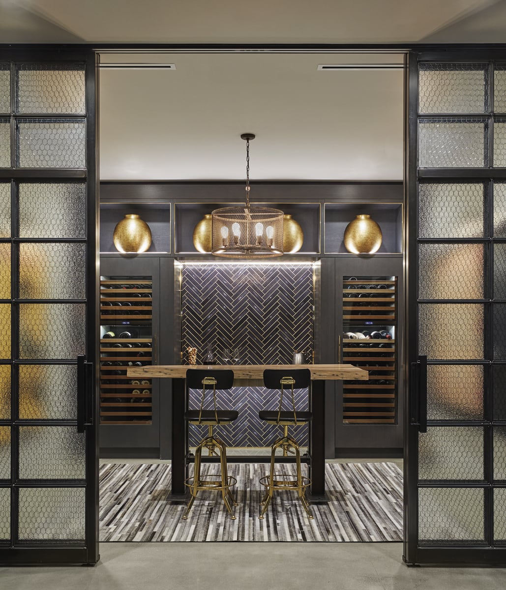
In the intimate wine room, Karp created a focal wall composed of shagreen-covered tiles in a herringbone pattern.

A shagreen-clad wall draws the eye to the cozy wine room, with Sub-Zero wine columns and a custom tasting table.
The homeowners’ penchant for industrial chic is stamped through the residence, but Karp and Barker invested the space with details that offset the warehouse vibe. In the intimate wine room, Karp created a focal wall composed of shagreen-covered tiles in a herringbone pattern. Barker employed zinc panels to warm up the wall around the replace. Together, the two fashioned a unique bar for the living room, composed of pleated zinc topped with solid walnut.
Although spun, essentially, on an open plan, the unit is no one-note expanse, thanks to such eye-pleasing details as the darkly- grouted subway tile in the kitchen and the pendant, brass-framed open shelves over the bar. Even the oh-so-practical laundry room is elevated by a compass star pattern floor tile. And while the furniture follows an urbane palette of black, gray, and white, the massive dining table—made from planks of 150-year-old reclaimed maple strikes a dramatically generous note of conviviality, that come-and-sit spirit that is fundamental to a sense of home. Greater than the sum of its parts, this city aerie proves that restraint is not restraining, that a muted range of tones need not be bland, and that—in the right hands—less is never less.

Top left: The oak treads and handrails of the impressive, free-floating staircase hint at the flooring that covers unit’s upper level private spaces. Bottom left: In the master bath, the custom vanity with Watermark faucets from K&B Galleries is topped with Calcutta Gold marble, also used on the floor. Pendants from Visual Comfort through CAI Designs. Right: Brass accents combine with soapstone and Nero Marquina marble flooring in the elegantly moody powder room.