One Family Learns How to Adapt a Beautiful Gold Coast Home
Unexpected Color and Pattern Buoy this 1920s-era Gold Coast Apartment by Andrew Howard Designs and Architect Scott Simpson
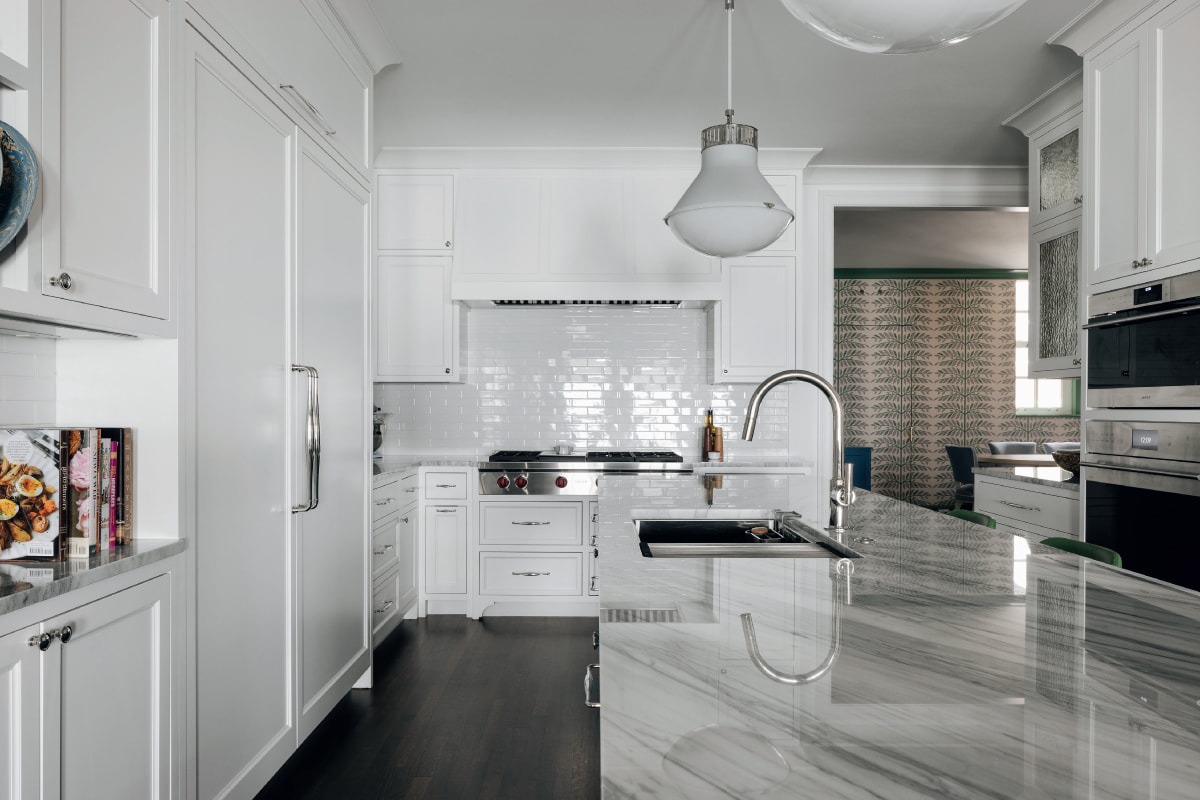
In the relocated, all-white kitchen, floor-to-ceiling cabinetry provides ample storage. Range and wall ovens by Wolf, Refrigerator by Sub-Zero, plumbing fixtures by Waterworks. Cabinet hardware by Classic Brass, through Katonah Architectural Hardware.
Eager to start a family of their own, a thirtysomething couple swapped their intimate one-bedroom apartment for a 4,500-square-foot unit on the seventh floor of a posh prewar midrise on North Lakeshore Drive. It was a return of sorts for the wife, who had grown up in the building and whose parents still owned a home there. While the bones were undeniably elegant, “The unit had not been touched for decades and looked like a grandma’s house from the early 1980s,” says principal architect, Amy Scruggs.
In addition to the dated design, the kitchen was far too small to meet the new homeowners’ needs, and the floor plan lacked the sort of gracious flow they envisioned. Among their many changes, Scruggs and her team transformed a butler’s pantry into a spacious kitchen, expanded the primary bathroom, created a powder room, and streamlined the floor plan. “Figuring out how to make all this stuff work was a real challenge,” she says. “The gymnastics that we do behind the scenes is exciting for me.”
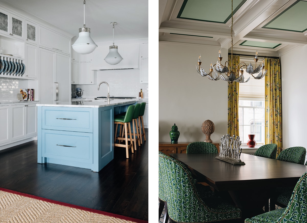
Left: The view into the kitchen from the great room is punctuated by a pop of sky blue on the island.
Right: A traditional chandelier illuminates a wooden table surrounded by upholstered chairs that coordinate with the painted ceiling detail in the great room.
Now accessible from the front foyer, the kitchen is outfitted with floor-to-ceiling white cabinetry accented with white marble countertops and a matching subway-tile backsplash. Playing off their traditional dinnerware, the island is painted in a sky-blue hue. Paired with dark green leather counter stools, it offers an intriguing preview of what’s to come. “The clients express themselves through color and pattern,” she says.
Indeed, the space opens to a spacious family room distinguished by a boisterous floral wallcovering—a visually stimulating backdrop for a convivial seating area anchored by a sectional sofa covered in a hunter-green velvet that closely matches the millwork and windows. Pops of powder blue, cream, and pink add additional layers. Interior designers, Andrew Howard and Meg Hickey, presented safe, daring and hybrid options to their clients, delighting when “they told us to push the envelope, and then they let us run with it,” Howard says.
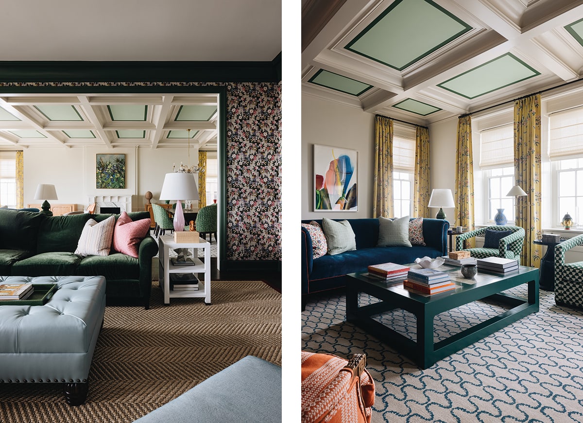
Left: A wallcovering and matching draperies by Lee Jofa, through Kravet, fosters a visually stimulating backdrop for the family room, where a rolled-arm sectional sofa covered in velvet anchors a cozy seating area.
Right: Designed to match the original, a coffered ceiling fabricated by Ashland Millwork brings down the scale of the spacious great room. Yellow floral draperies by Manuel Canovas, through Cowtan & Tout, add an unexpected pop of color and a patterned rug defines a cozy seating area.
Yellow patterned draperies, for example, pop against the neutral walls in the cavernous formal living room, which has a new coffered ceiling that the designers painted in two shades of green. “It brings down the scale of the room,” Scruggs says. A pair of matching patterned rugs define spaces for living and dining on either side of a fireplace with a traditional mantel and a white marble surround. “The client grew up in a very traditional setting, and we were trying to sort of recreate a more youthful version of that,” Howard says.
Distinguished by its groin-vaulted ceiling, the walls in the private elevator vestibule are covered in a wallcovering with a cheerful lemon tree pattern. “It has an orangery feel that is super unexpected and makes a great statement,” Howard says. An equally graphic wallcovering with a colorful fern motif enlivens the newly created breakfast area, where a shaded pendant illuminates a delicate oak table surrounded by blue upholstered chairs.
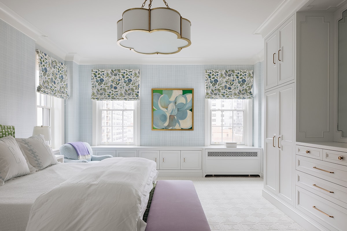
Built-in cabinetry by New Style Cabinets provides additional storage in the serene primary bedroom suite. Pale blue walls contrast with the crisp white bedding. Roman shades by Lee Jofa, through Kravet.
The palette flows throughout the interior. An energetic green-and-white upholstered headboard commingles effortlessly with a light-blue wallcovering with a thatched pattern in the primary bedroom suite. A dark blue and white rug complements the light-blue lacquer walls and built-in cabinetry in the office. “It’s a modern take on a traditional wood-paneled study,” Howard says, noting that the reflective surface bounces light around the room “This room feels bright and happy, even when the sky is gray.”
The owners are happily settled in their revitalized home, recently welcoming their first child. With clients like these—involved yet trusting and even adventurous—Howard says it’s no surprise that the project was such a triumph. “The most successful projects are when you have clients who have a clear vision, and then they trust you to execute,” he says. “We had a perfect marriage of that on this job.”
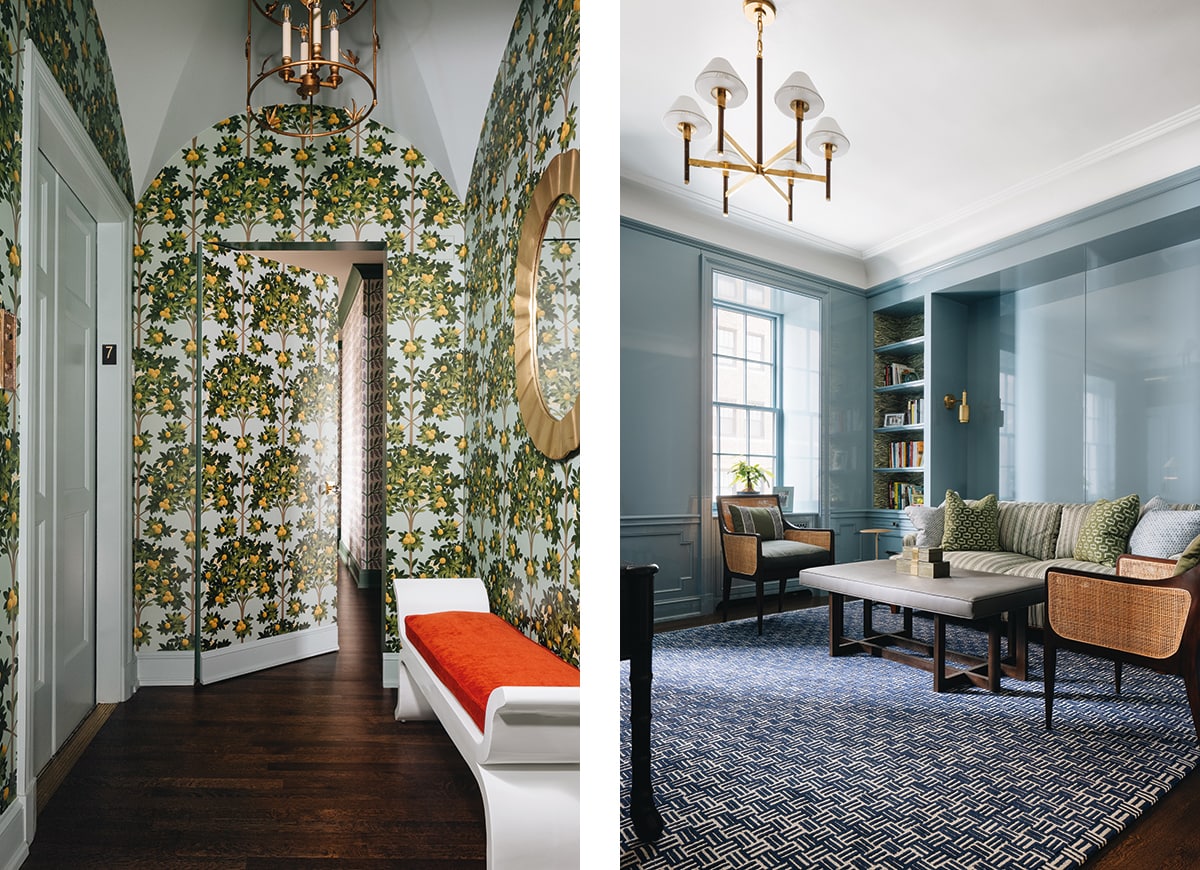
Left: A lively wallcovering by Lee Jofa, through Kravet, adds a whimsical quality to the elevator vestibule.
Right: Lacquered in a blue that reflects the natural light, the library’s millwork and built-in cabinetry by New Style Cabinets walk the line between tradition and modernity. The sofa is covered in a tailored stripe by Lee Jofa, through Kravet.