Modern Palette
A colorful update adds excitement to an historic Chicago home.

In the media room, designers Lozano Ziol and Jolas covered the walls in a textural vinyl grass cloth wallpaper from Phillip Jeffries. A tete-a-tete sofa from A. Rudin allows guests to enjoy double-sided conversations with anyone in the adjoining living room while perching under the ceiling’s gorgeous, decorative molding.
It’s not every day that designers with an affinity for melding classic, high-end residential interiors with a modern edge land a project that demands just that sleight of hand. So, when Lauren Lozano Ziol and Michelle Jolas, co-founders of design firm SKIN, were contacted to revitalize an historic home in Chicago’s popular Lakewood neighborhood, they were thrilled. Located on a charming street lined with big, beautiful pre-war mansions, the structure’s old-world appeal was indisputable—but it needed a contemporary update.

Left: The kitchen’s uber-sleek look belies its functionality. Faucets from Brizo keep to the aesthetic.
Right: The designers painted the dining room walls a dark black hue to contrast with the high- gloss white-painted ceiling. A Christian Liaigre dining table through David Sutherland anchors the room, while artfully arranged, vintage, framed Chinoiserie panels line the walls for a dramatic effect.
“The whole first floor was paneled in a dark wood, with dark molding,” explains Lozano Ziol. “They really wanted to adhere to the home’s historic nature, but they wanted it to feel fresh and updated, with a sophisticated modern elegance.” Understanding their concern, Lozano Ziol convinced them to paint most of the dark wood paneling throughout a dazzling shade of white.
“It’s rich and regal, with the elegance and architectural details you don’t see in a newly built home.” —Lauren Lozano Ziol
“It opened up the space,” she said. “You’re still able to see all the beautiful millwork, the design on the stairs, and especially the decorative moldings on the ceiling, but now it all pops.” The entry was also given a bright and airy makeover. Dark, heavy stained-glass windows that kept natural illumination at bay were replaced with leaded classic windows adorned with an alluring glass design that floods the space with light. “It set the precedent for the rest of the house,” says the designer. For a renewed, modern sensibility in a traditional frame, the designers implemented a palette of teals, blues, and greens throughout to bring the outdoors in and add a sense of vibrancy that contrasts beautifully with the predominantly white base. Old world fabrics that pay tribute to the home’s architecture, such as mohair, velvet, and linen with tape trim, were incorporated alongside more contemporary plaids, geometrics, and clean-lined furniture—perfectly catering to the clients’ differing design styles while yielding a masterful blend of modern and traditional.

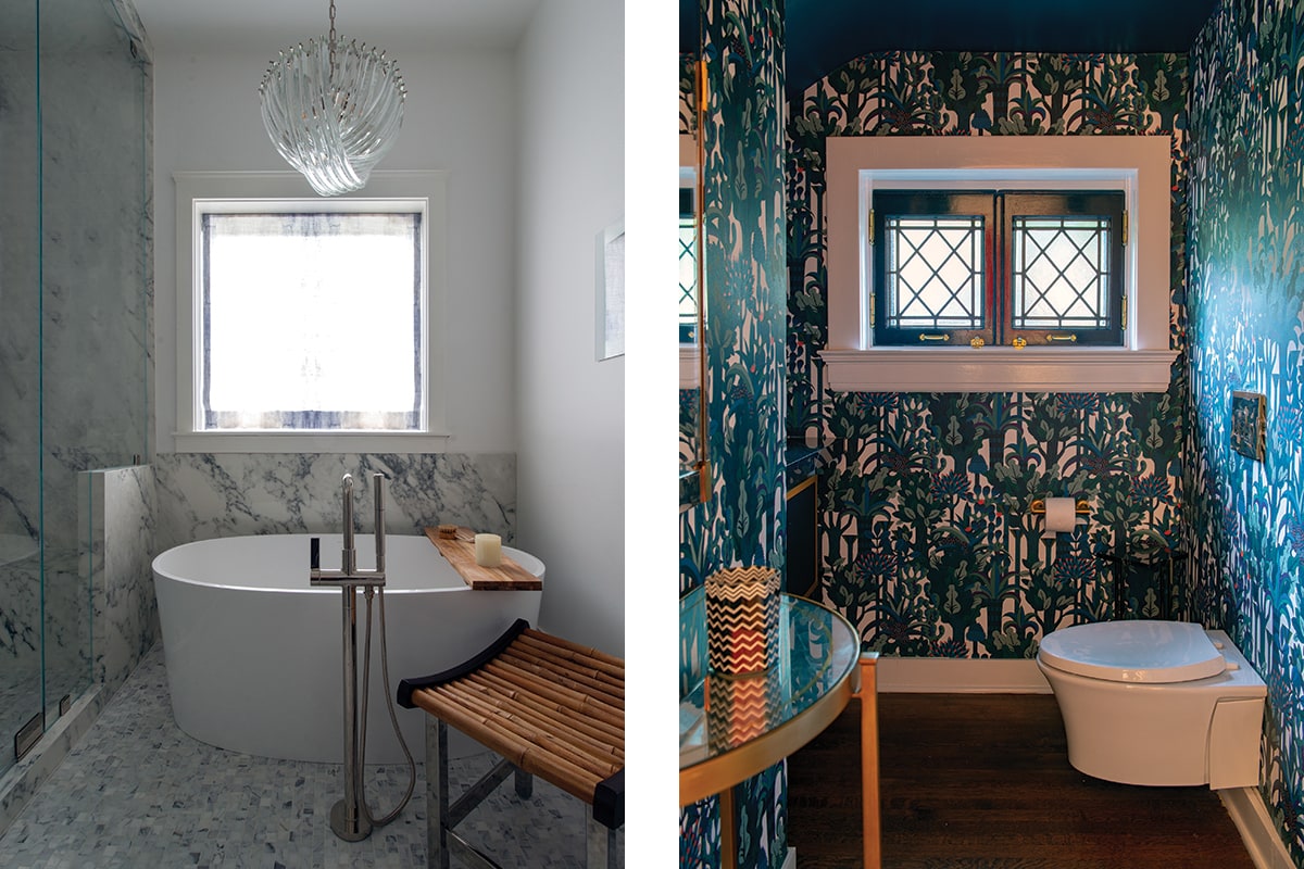
Left: The master bath is outfitted with a mesmerizing marble-like porcelain stone by Porcelanosa, a modern tub, and a midcentury chandelier.
Right: A stunning wallpaper from Hermès through Holly Hunt transforms a powder room into a jewel box.
In the living room, a striking Holly Hunt purple side table plays off the white Roman window shades defined by a Samuel & Sons trim in a Greek Key pattern. Teal- hued throw pillows in fabric from Fabricut tie into the vibrant textile distinguishing the bench cushion behind the curvilinear sofa. A tete-a-tete sofa from A. Rudin allows guests to enjoy conversations in both the living room and the adjoining media room.
The media room is a warm, intimate room that offers a study in contrasts with a curved, neutral-hued sofa and walls covered in a saturated blue Phillip Jeffries vinyl grass cloth wallcovering. Custom-designed Macassar ebony paneled doors slide open to reveal a TV. Throw pillows in fabrics from Holland & Sherry complete the comfort-meets-cool look. It’s also the perfect place for a pre-dinner cocktail before entering the ultra-glamorous dining room. A stately Christian Liaigre dining table takes center stage, while an avant-garde Sputnik chandelier, and a modern artwork over the fireplace add touches of whimsy. Decorative ceiling molding in a high-gloss white is offset by walls painted deepest black. Artfully arranged, framed Chinoiserie panels line the walls—forming the perfect juxtaposition of old and new.

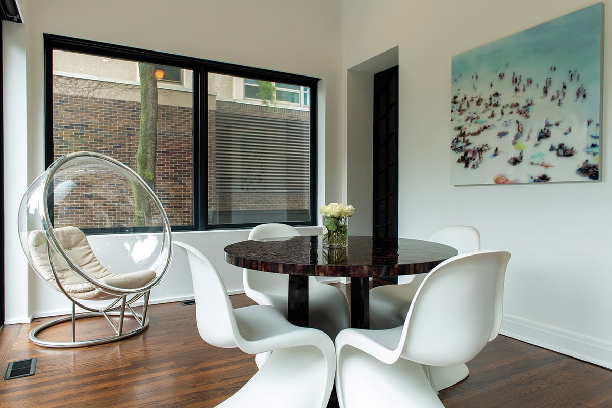
The breakfast nook’s casual-meets-chic vibe is enhanced by a summery beach photograph and space age elements like the midcentury molded plastic chairs by Verner Panton.
In the kitchen, the designers accentuated the ceiling heights by painting half of the cabinets in a rich blue shade that helps open the space up. Faucets from Brizo keep to the clean-lined aesthetic. Hints of drama abound throughout the home. A powder room covered in a floor-to-ceiling Hermès botanical-laden wallpaper forms a show-stopping moment. Meanwhile, in a more subtle dramatic fashion, a master bath is outfitted in a gorgeously veined modern stone and a midcentury chandelier, keeping to the mix of old world meets modern.

Roman Shades defined in trim from Samuel & Sons allow the molding in the living room to shine. Directly underneath, a bench cushion upholstered in fabric from S. Harris through Fabricut forms an eye-catching focal point. A curvilinear sofa upholstered in a green mohair and funky white chairs bring a modern element to the room. in the corner, a jewel- like table from Holly Hunt adds a pop of contrasting color.
“The clients were really in tune with what we were doing,” says Lozano Ziol. “I love how we transformed the space with paint—it brought this fresh new life to the space. It made it feel like a modern family home with the sophistication of a bygone area. It’s rich and regal, with the elegance and architectural details you don’t see in a newly built home. We layered the space with beautiful fabrics and textures that let the architecture shine.”