Leaving NYC: How To Gain Space Without Losing Your Design Identity
A condo, refreshed to focus on light and space, retains pieces of the past.

Catching the light are ombre sofa pillows from Weitzner LTD and gold patterned pillows via Lee Jofa through Kravet. Also shining: a mink finish on the Lorts cocktail table and an Amarone finish on the Vanguard nesting tables, through J. Marshall Designs.
When a family relocated from New York to Minneapolis, they wanted their condo home remodel to emphasize that their living space had nearly doubled—while still highlighting reminders of their earlier life. Enter Krystal Kellermann, senior interior designer at Martha O’Hara Interiors. “It was my job to give them an aesthetic vibe that reminded them of that city lifestyle,” Kellermann explains. “We repurposed art and accessories from their previous home that had sentimental value to them, making sure that every room in the home had a piece of New York somewhere within it.”
Kellermann wanted a look that framed the home’s views. Highland House helped a pair of low sofas pop with lustrous turquoise velvet. A black accent table with bird legs and a stacked bone floor lamp come from Arteriors Home. Currey & Company bring the eye higher with a black console table and silver leaf wall sconces. It’s anchored by an area rug from Prestige Mills. “This seating arrangement creates a structured formality that compliments the windows,” notes Kellermann.
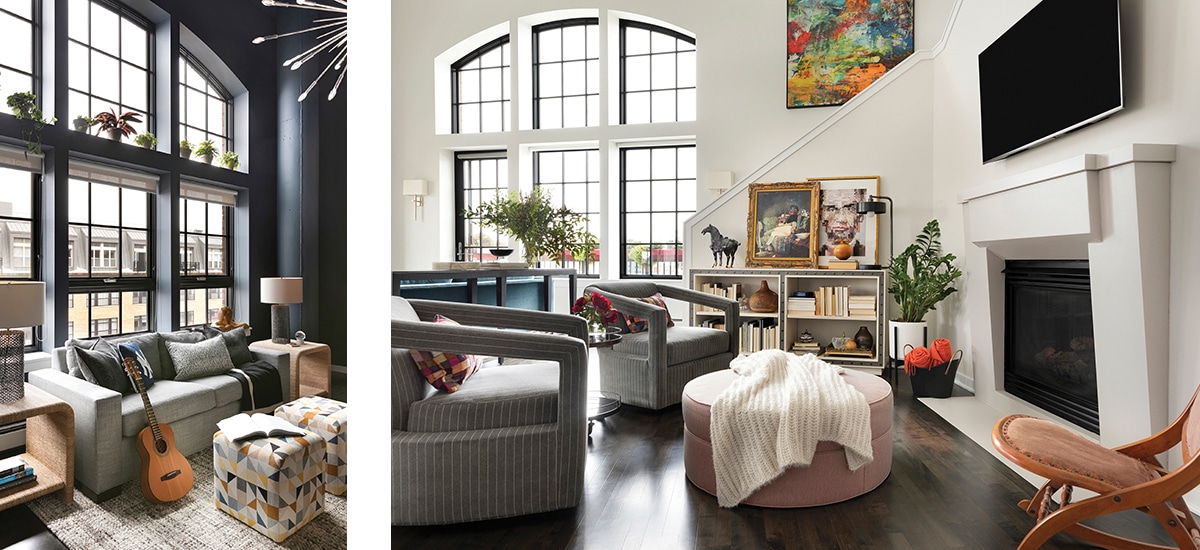
The eye travels to a second seating area, designed for double duty. “We wanted the fireplace sitting area to stand on its own but also to be part of the main living space,” she explains, “so we opted for swivel chairs.” The chairs from Century Furniture flank an oversize ottoman from Lee Industries, and a drink table from Vanguard Furniture. A blanket storage bin from Arteriors Home (who also provided the industrial table lamp) calls for cuddling.
The light feels different in the teen bedroom with walls in Benjamin Moore Blue Note. “We wanted to create a moody atmosphere,” Kellermann says, “and decided to bring it up onto the ceiling for added drama and continuity.” A lofted bed makes space for a media console, which can be enjoyed from perches including a gray sleeper sofa by Vanguard Furniture, a desk chair from Bernhardt Design, and cube ottomans from Lee Industries.

Left: A moody blue canvas boasts bursts of added interest, courtesy of contrast pillows in fabrics from Kravet and ROMO, jute rope end tables from Hooker Furniture through J. Marshall Designs, an area rug from Jaipur through Designers Linen Source, plus chain link table lamps and a statement chandelier.
Right: Dig the details: gray velvet pinstripe fabric graces the swivel lounge chairs from Century Furniture, coral fabric via Vanguard through J. Marshall Designs hugs the oversize ottoman from Lee Industries, and faux bone adorns the bookcase from Currey & Company, both through CAI Designs.
Back in the dining area, the situation was black and white. “The living room sofas were going to be a bold color. To keep that look sophisticated, we chose a classic black and white palette in the adjacent dining room,” says Kellermann. That includes wood veneer wallpaper from Innovations in Wallcoverings, a dining table by Vanguard, and curved-back dining chairs via Hickory Chair. The color story continues in the kitchen. “It was certainly the intention to unite the kitchen and dining room palettes.”

Dining area scene stealers include a chandelier from Currey & Company and illuminated glass cabinets displaying accessories sourced from Global Views, both through CAI Designs. An added bonus? Kellermann says those white Hickory Chair dining chairs stand up to spilled red wine.
“Painting the maple windows black made a huge impact. They now feel fit for the space.” —Krystal Kellermann
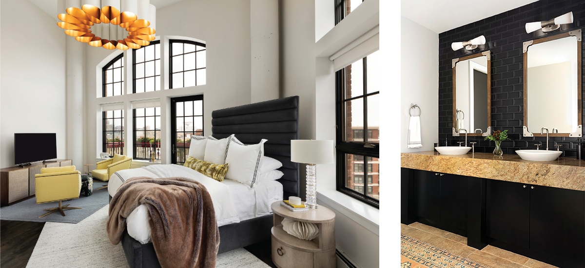
Meanwhile, in the master bedroom: “Using layered wool rugs and oversized artwork to anchor them, we created two defined areas within this large room,” Kellermann says. “We have a clear sleeping space with the dresser on one side and a secondary reading and TV lounge space.” The round nightstand and channeled bed in graphite upholstery (dressed in Pine Cone Hill bedding through Designers Linen Source) are from Vanguard Furniture. A dramatic chandelier from Currey & Company hovers over sitting area swivel chairs from Vanguard—with Jim Thompson Fabric Upholstery—opposite a textured front media console by Bernhardt.

Left: Kellermann says the floral velvet fabric from Designers Guild through Osborne & Little, on the Lillian August ottoman through deAurora, was the inspiration for the master bedroom. Other nice touches include a custom kidney pillow with ROMO fabric, chairs by Bernhardt Furniture through J. Marshall Design, and ottomans by Lee Industries through CAI Designs.
Right: “Black and white is classic and timeless,” says Kellermann of the master bath, which features nickel sconces with crystal rods from Visual Comfort through CAI Designs. “It will never go out of style and can be paired with any accent color.”
“It was so much fun to see such a dramatic change,” says Kellermann. “Before we started, the interior was dated and too traditional.” But even as she freshened the space, she grounded it with nods to the past. “We were so fortunate to be able to incorporate the clients’ existing antique accessories collected from their travels,” she says. “These additions add so much character to an otherwise modern space.”