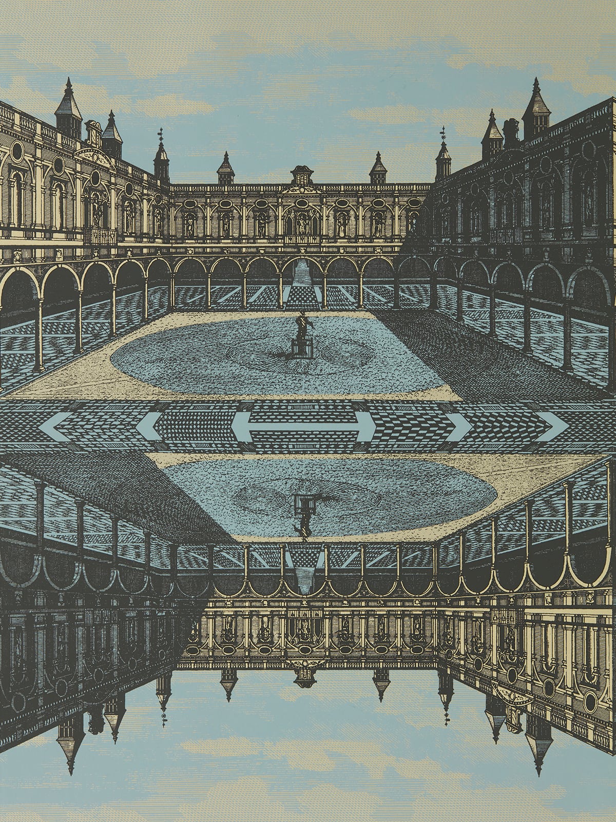
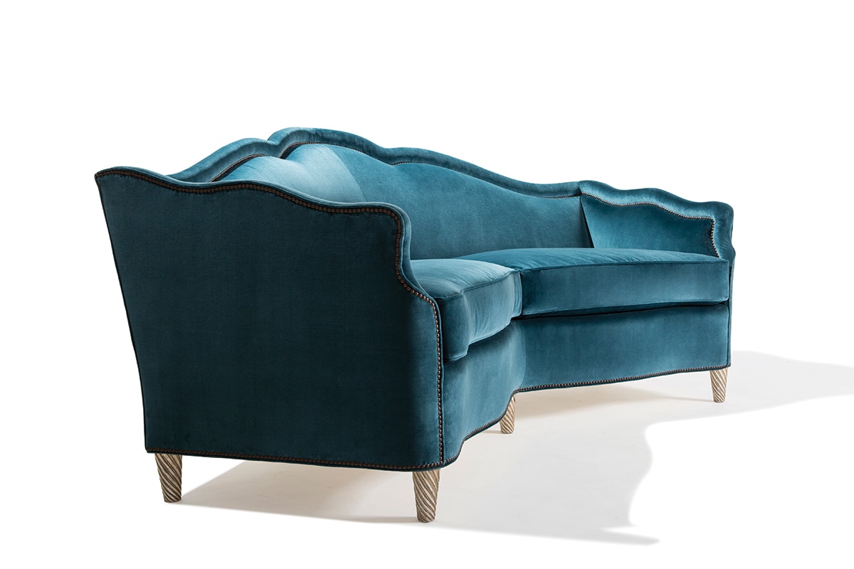
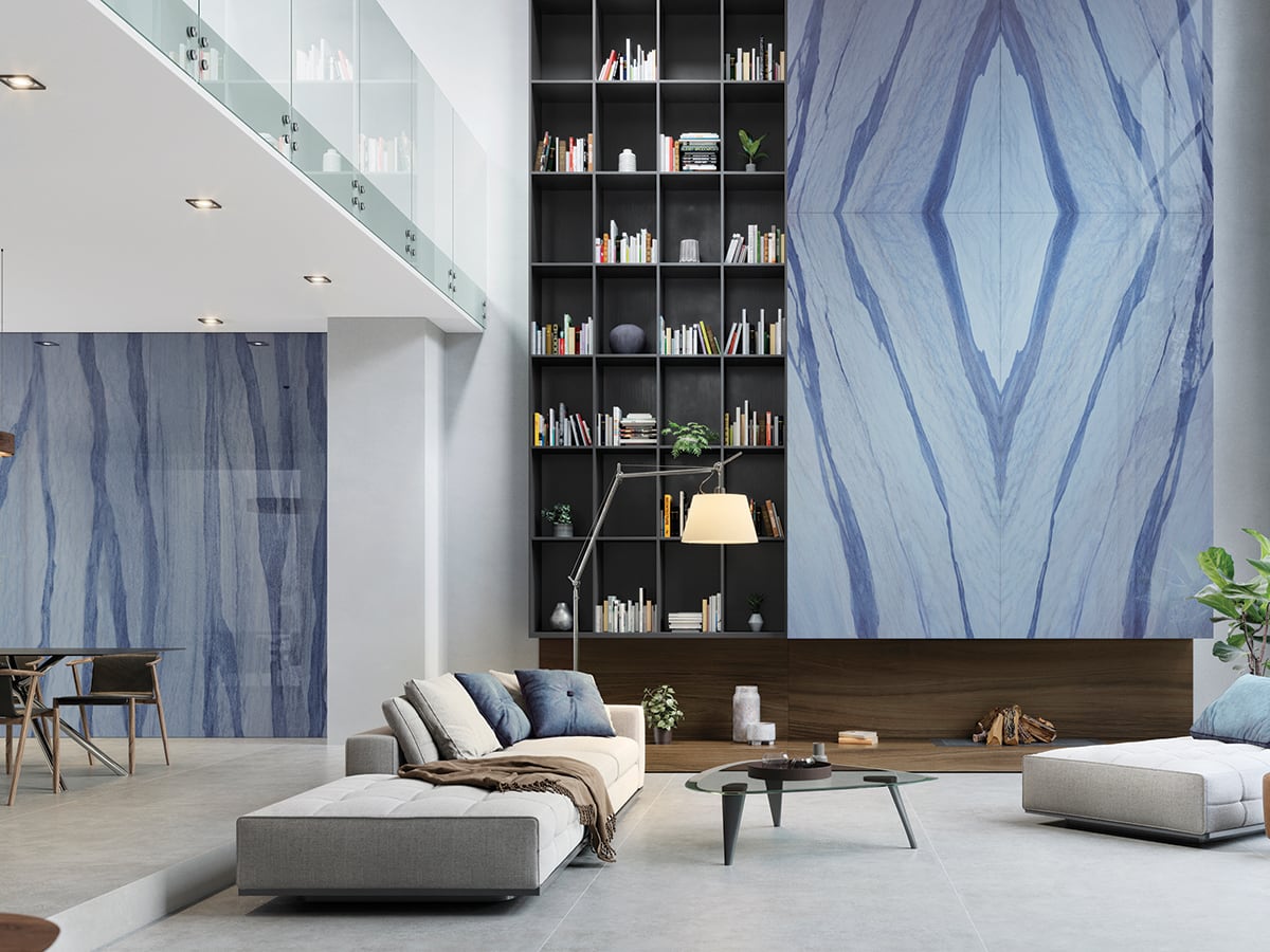
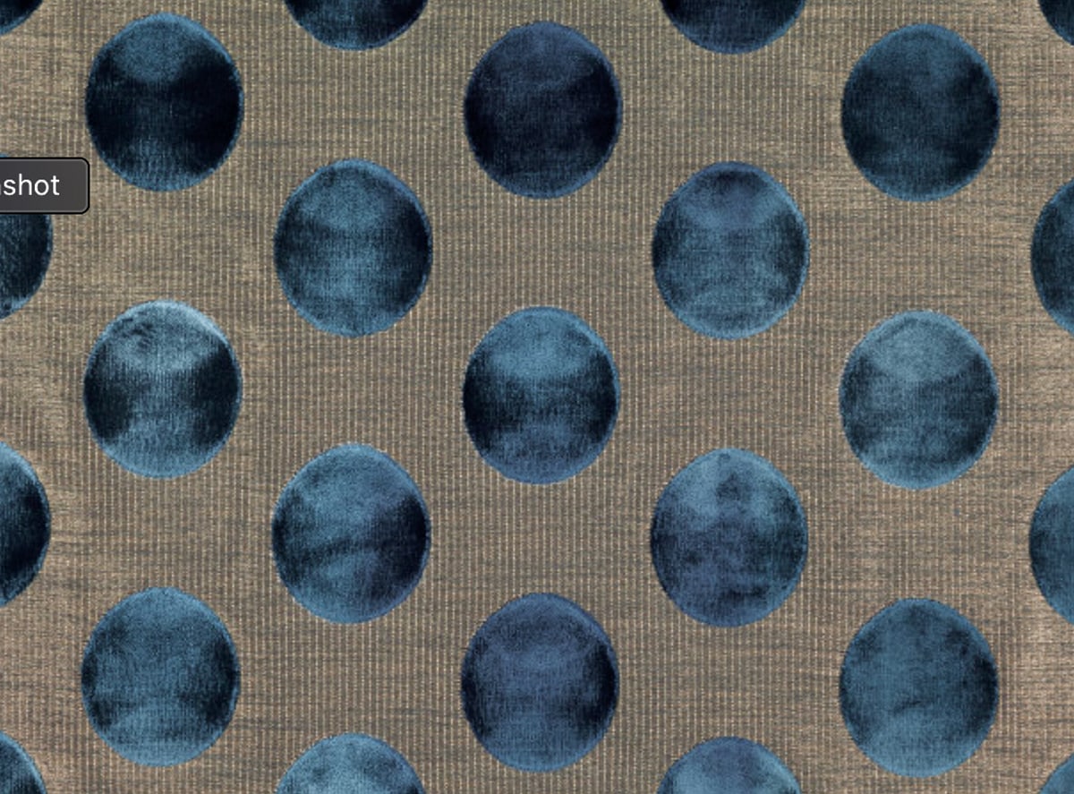
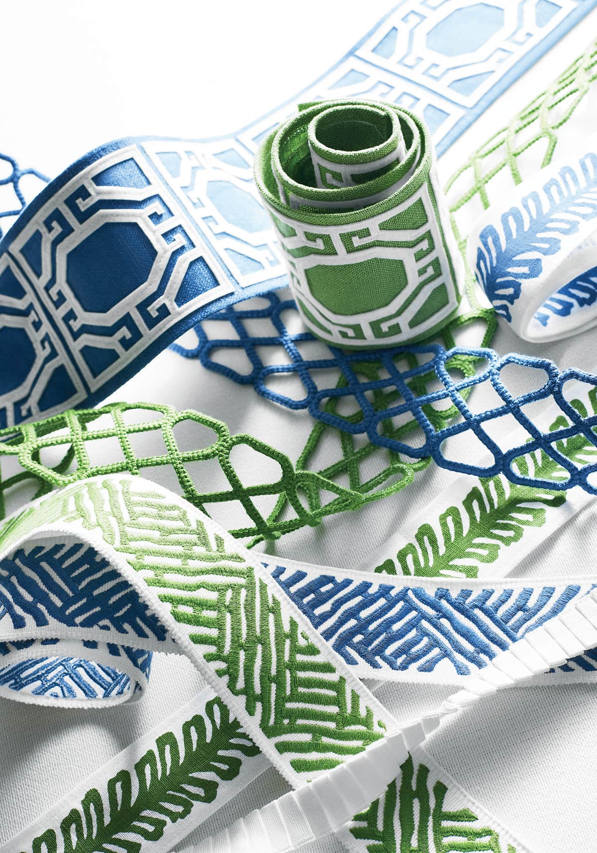
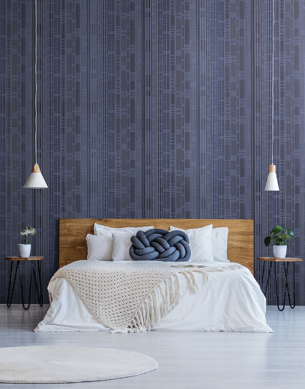
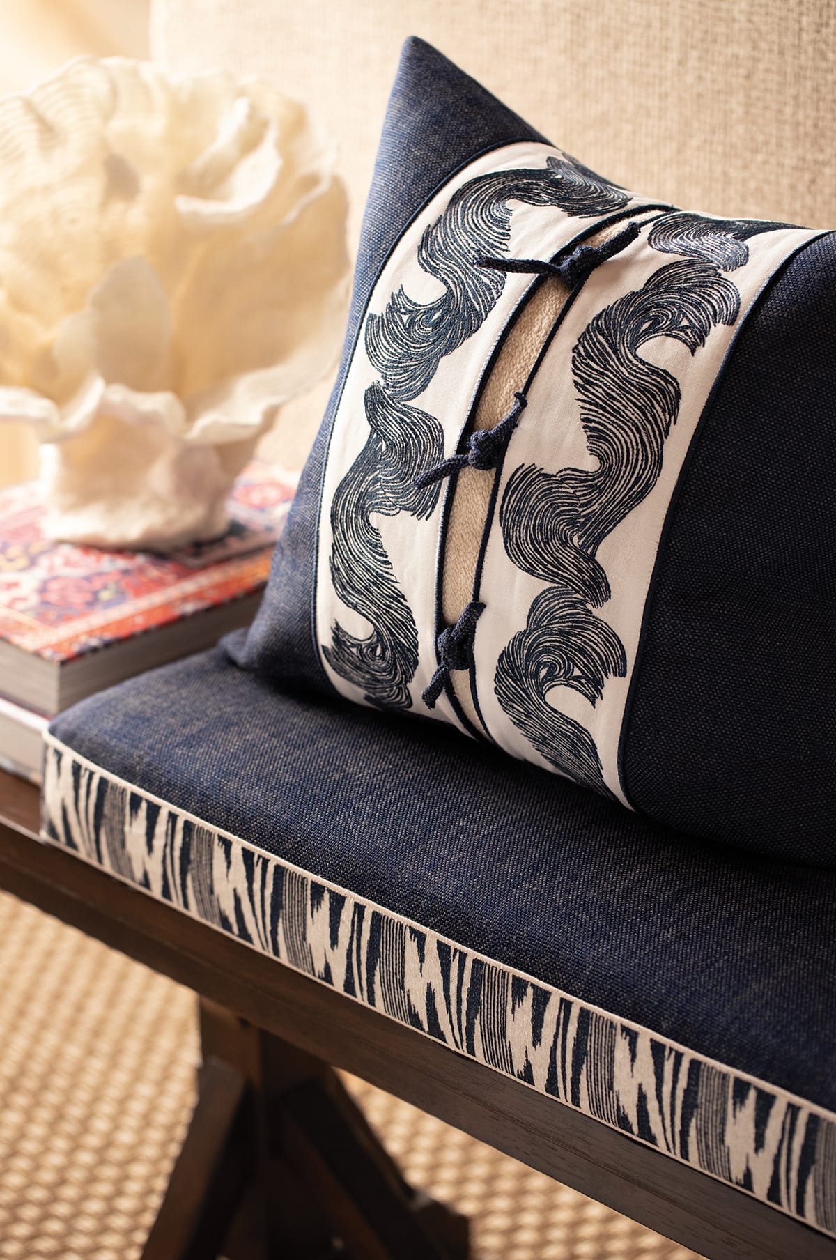
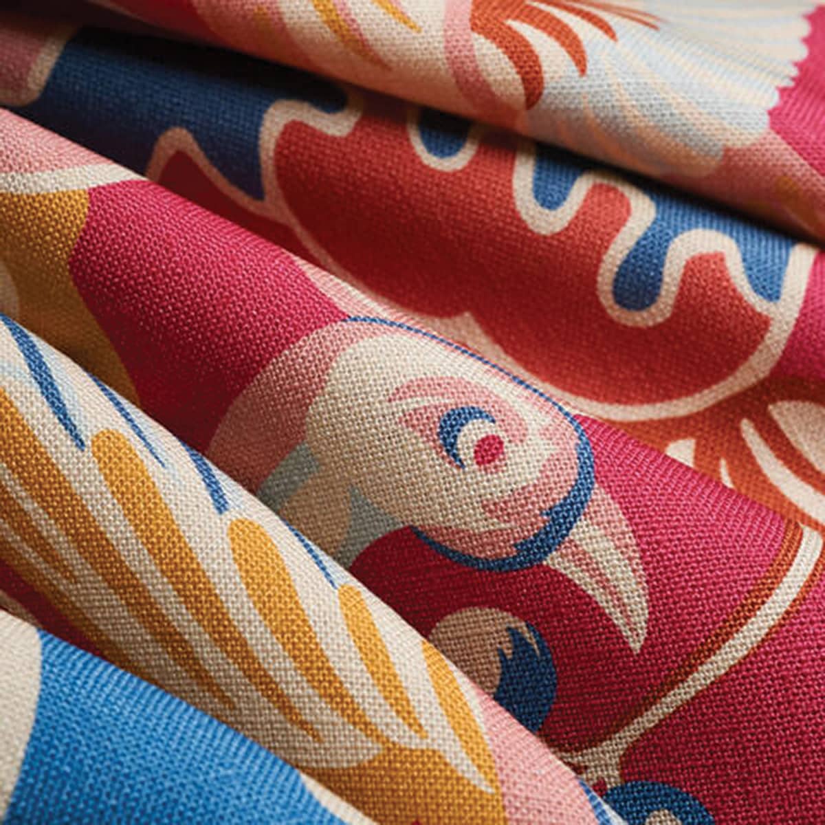
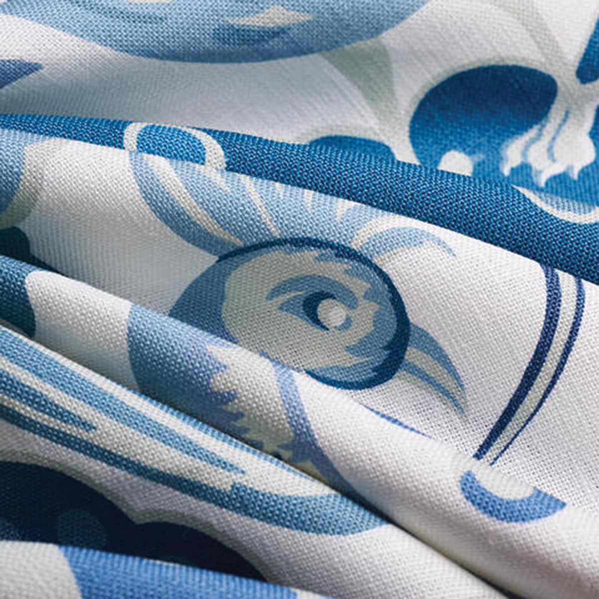
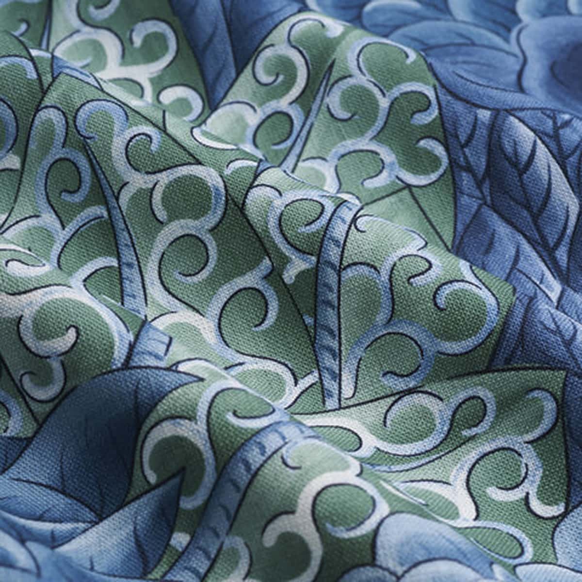
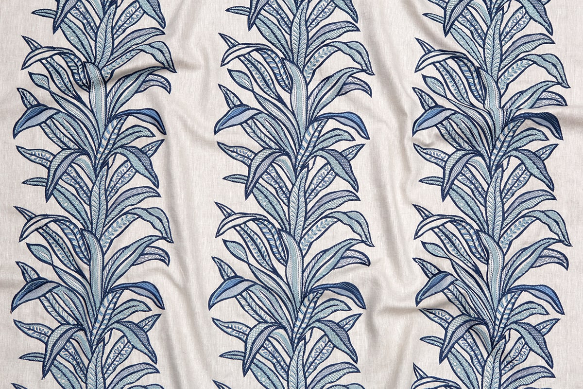
Moody Blues
A wave of blue, from deep navy to robins’s egg.
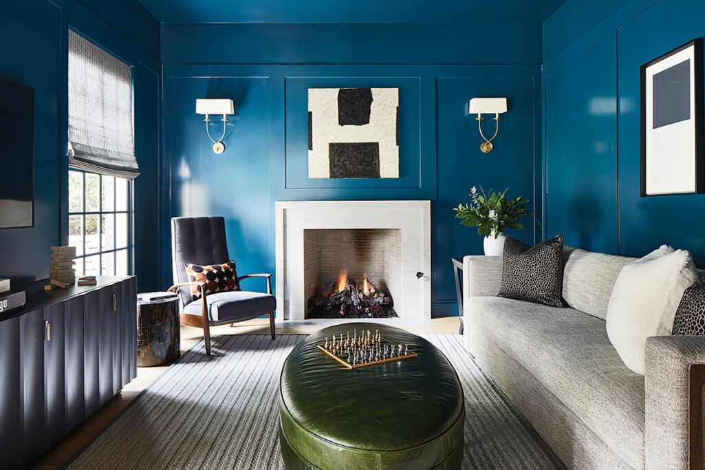
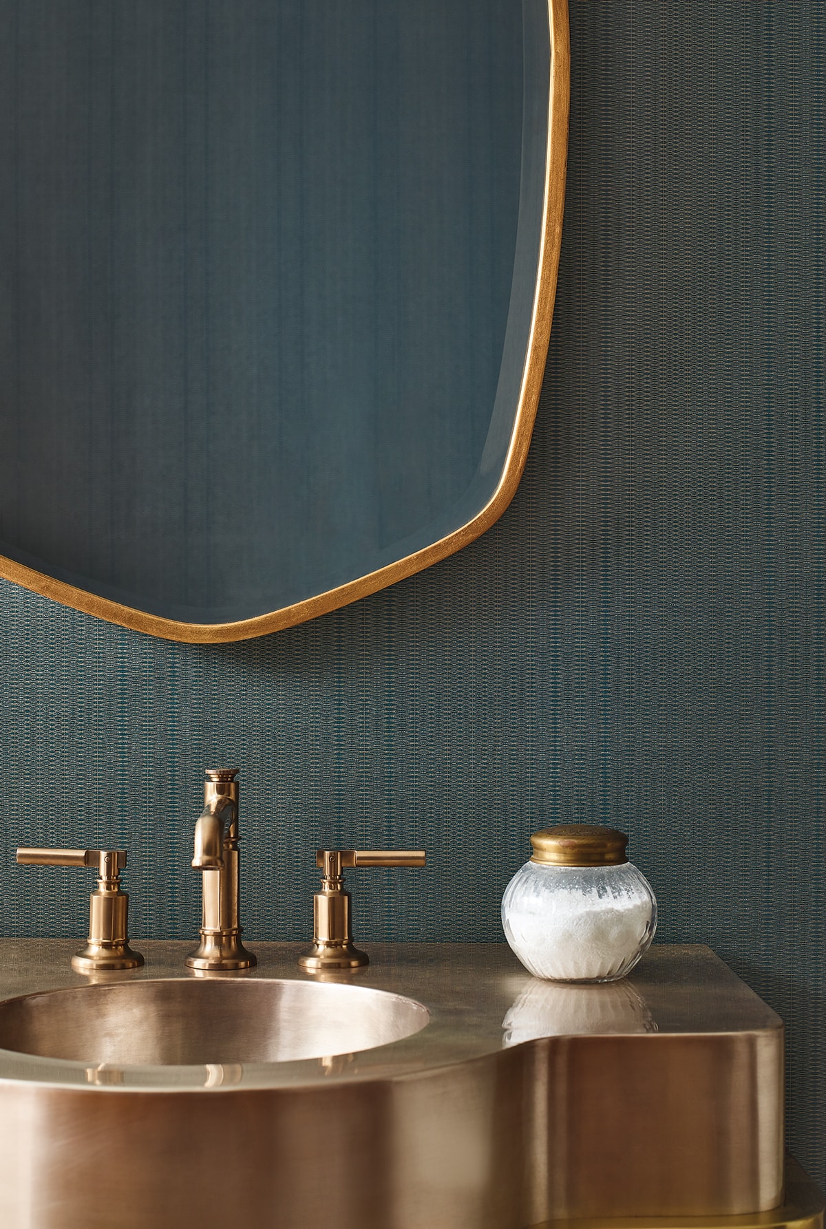
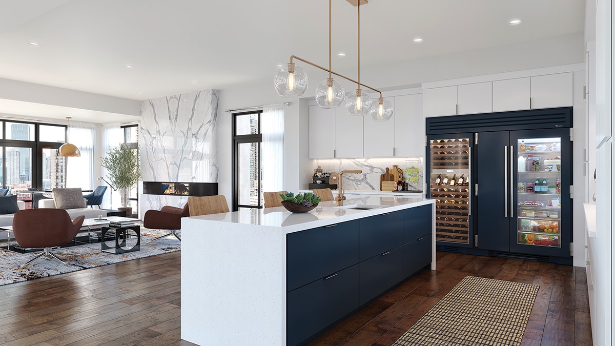
READING ROOM For this remodel of a 1980s home in Austin, Texas, designer Martha O’Hara chose to envelope the study in Moscow Midnight, a luminous shade from Sherwin-Williams. The moss green leather ottoman from Lee Industries through CAI Designs and scalloped-front console in cool grey by Vanguard from J. Marshall Design add contrast.
An area rug by Stanton Carpet through Watson Smith anchors the room. The formal sofa from Vanguard is covered in taupe performance fabric. The reclining midcentury-style armchair, inspired by a Milo Baughman design, is from Thayer Coggin, and the double sconces in antique burnished brass are from Visual Comfort, both through CAI Designs.
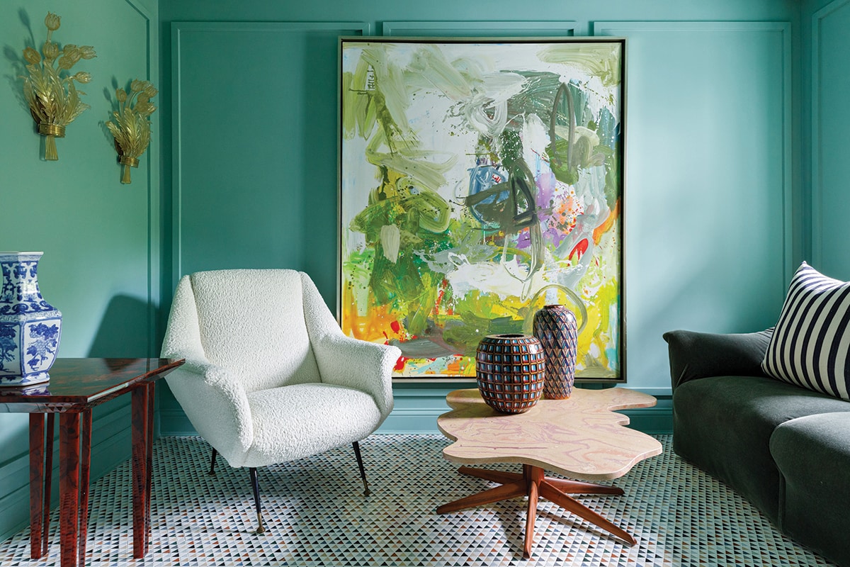
Trendy colors come and go, but the classics are forever, for a very good reason. Blue is indisputably a classic. There is nothing more valuable in the world of design than a color that, chameleon-like, can go with everything, from tangerine to ballet pink to forest green. The French artist Yves Klein was so enamored of it that he invented his own, now known as International Klein Blue. It is such a pure color that people who are colorblind can often see it clearly. Klein explained his passion for the color thusly: “Blue has no dimensions, it is beyond dimensions, whereas other colors are not…. All colors arouse specific associative ideas, psychologically material or tangible, while blue suggests at most the sea and sky, and they, after all, are in actual visible nature what is most abstract.” As demonstrated here, the versatile shade can be used as a universal base, a theme that runs through an entire room, or the most subtle of accents. Embrace the blues!