On the Surface
Add visual impact in unusual ways with surfaces that add that wow factor to every room.
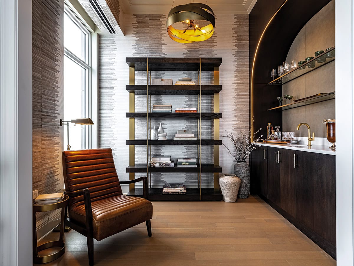
Lakesha Rose of L Rose Interior Design created a magnificent bar for a client to entertain family and friends. She says, “We took some exciting risks in the space. We created a leather backsplash and we customized the glass shelves to make them look distressed. The hand-hammered sink adds drama. The entry, which has the same sight line as the bar, has a quieter feel so it doesn’t compete with the dynamic and bold wallpaper in the bar. Leather by Edelman Leather. Wallpaper by Phillip Jeffries. Paint by Benjamin Moore. Hardware by Katonah Architectural Hardware. Photography by Logan Bowles
Choosing the correct surface materials in any space can make or break the design. Choose wisely and add texture, dimension, sparkle, and major visual impact. Choose poorly and the bones of your room get lost in ho-hum obscurity. Good designers understand that small corners or receding elements may not be the first thing you notice in a room, but they can add electricity to a space just by applying the right surface.
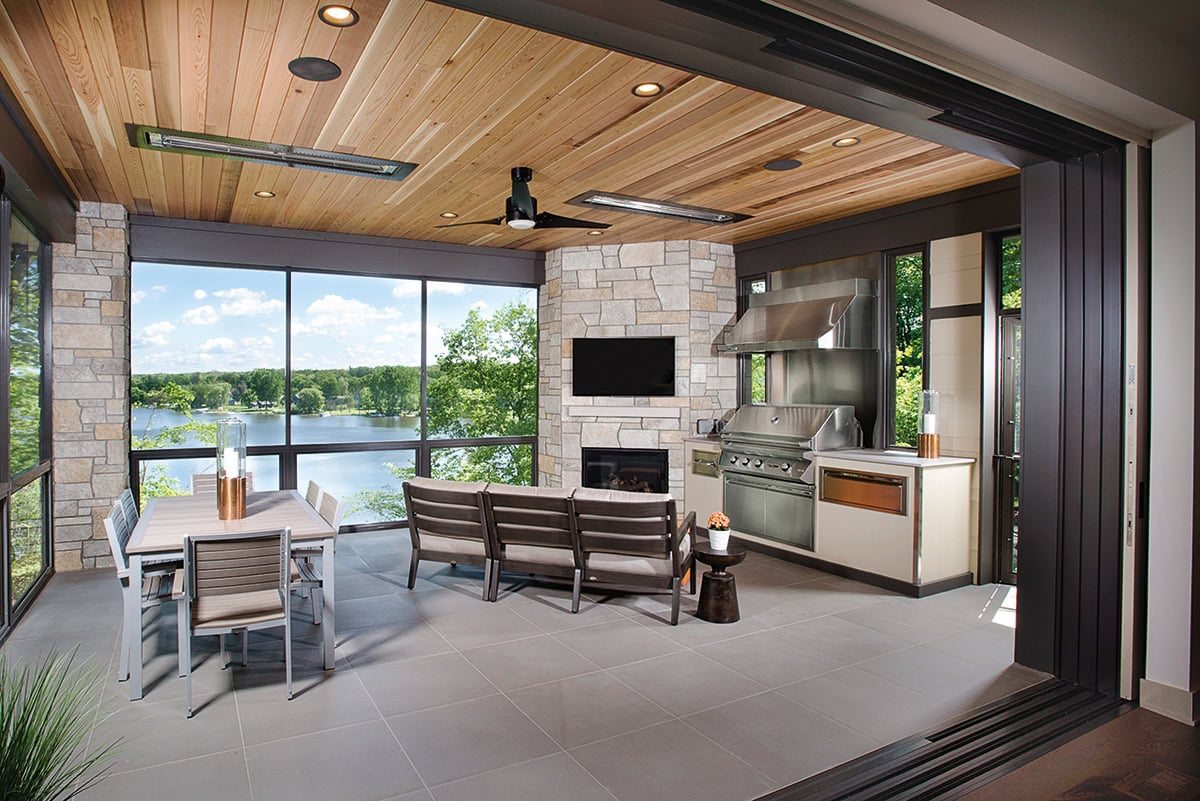
Our portfolio showcases spaces from top designers who understand the power of the right surface, from a sexy leather-clad bar to a bejeweled spa shower to the rugged stone exterior of a prairie-style home.
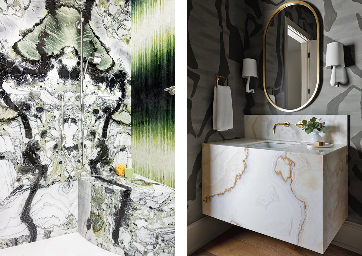
Left: A bath in Tenafly, New Jersey, has graphic appeal, created by Billie Ombre mosaic tile in green, paired with White Jade marble slab, both from Artistic Tile. White Jade is a vibrant and dynamic marble full of veins, streaks, and clasts in colors ranging from ink black to charcoal to pale silver-gray, contrasting with greens, from jade to sage to fresh olive.
Right: In Nashville, a powder room vanity is clad in vanilla onyx cross-cut slab marble from Artistic Tile, creating a pale glow against the graphic wallcovering.
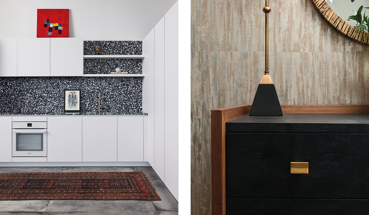
Left: Eric Rothfeder designed this painter’s studio and guest suite in historic Catalog House in the River North neighborhood of Chicago. To imbue the space with a creative feel, he stripped away unnecessary walls and materials to reveal the unique industrial character of the space. The roughness of the exposed concrete finishes contrast with moments of refinement and drama, such as the use of polished terrazzo in the imported Italian kitchen, porcelain tile for the floors, and the walls of Lilac marble in the bathroom suite, all from Artistic Tile. Appliances from Miele. Photography by Mike Schwartz
Right: The designers of Divvy House used Liaison tile by Kelly Wearstler for Ann Sacks to give an entry hall warmth and a painterly feel. Photography by Angelika Friday
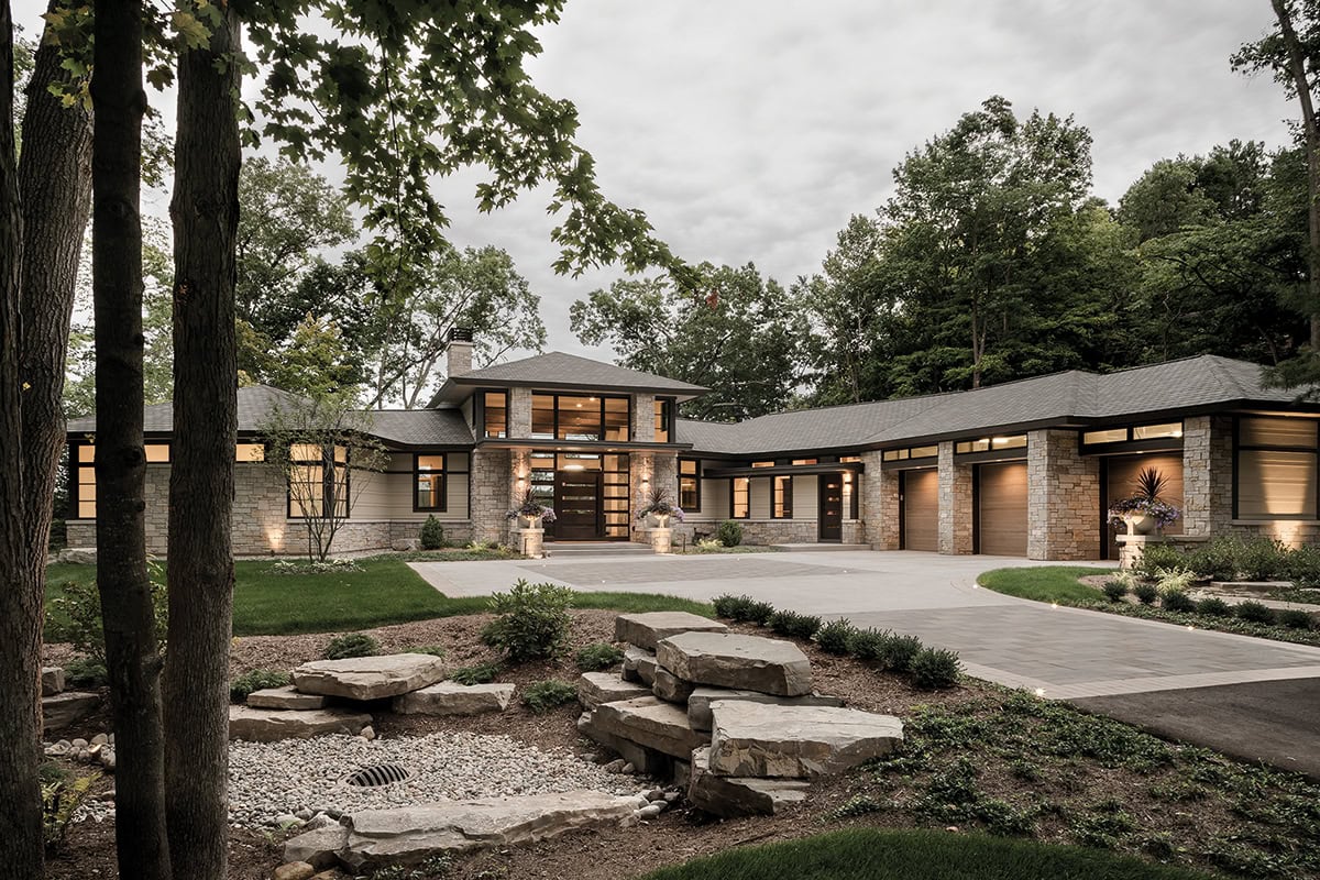
This and below: For a modern, prairie-style home in Grand Rapids, Michigan, 42 North Architects used Buechel Stone’s Fond du Lac and Mill Creek Tailored Blends throughout the interior and on the exterior, including spaces like the entryway and the enclosed patio.
